
The day has come – the Ducks have brand new football uniforms for the 2018 season, which means that once again there will be no shortage of fodder as it relates to what the team will be wearing on Saturdays this fall.
And though a fashion blog we are not, that doesn’t mean we shy away from providing runway analysis as if we had a front row seat to Fashion Week in Milan.
Love ’em or hate ’em, below are Oregon’s 2018 uniforms, along with some general thoughts and takeaways from both this blog’s male curator and his female better half.
Flying toward tradition. #GoDucks pic.twitter.com/hGD7FHuVEn
— GoDucks (@GoDucks) August 16, 2018
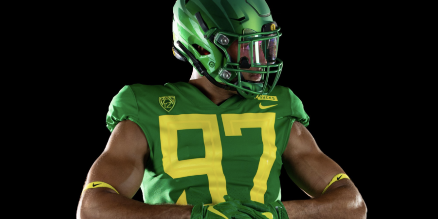
What He Said: It’s hard to knock the apple green aesthetic, regardless of the jersey’s overall design. Of all the jerseys featured in Oregon’s new rollout, this version is one of my two personal favorites. Like the rest of the jerseys unveiled Wednesday, it’s a simple, clean look that is unmistakably Oregon based on the color scheme. The presence of the green wings on the green helmet is a nice touch, too. The only gripe: those cartoonishly oversized numbers. The Ducks have worn practice uniforms with the jumbo numerals in the past, but to see them implemented on their new game uniforms is jarring, which is about the nicest thing I can say about them.
What She Said: I instantly loved it. The simple, yet well placed, pops of color really enhance the overall design/feel. Oh, the helmets…the green paint doesn’t seem as glossy as the others, but it stands out in its own way – it reminds me of Christmas tree ornaments. I think the number detailing is interesting, too. I feel like the green/yellow combo works, where as the yellow/black does not. The yellow is more offset which draws the eye. With the black numbers, it almost looks as if someone spilled water on his jersey. The shoes are the same design as the yellow/black combo but stand out for a different reason – texture. At first glance, they appear to simulate duck feet but without a schticky feel. There’s great use of contrasting colors and textures to tie everything together there.
Reimagine your identity. #GoDucks pic.twitter.com/YhGZrpGenk
— GoDucks (@GoDucks) August 16, 2018
What He Said: Oregon’s all-yellow uniforms have always been a struggle for me to get behind, and these are really no different. The simplicity of the jersey’s design scores points, but on the whole, it’s really not all that dissimilar from the yellow uniforms the Ducks wore last season. The main difference, of course, is the the absence of the seemingly spray-painted wings on the shoulder pads that were present on last year’s yellow unis. The silver wings set against the yellow on the helmet is a good look though, and the nameplate on the back of the jersey is a unique element that is unlike just about anything that currently exists in college football.
What She Said: Womp, womp. Sadness. There’s so much potential, but this one falls flat. It’s almost as if they poured all of their energy and resources into the other jerseys and made yellow the redheaded child. The body of the uniform looks like someone ironed stickers onto cheap practice jerseys. The helmets are an example of yellow well executed, however. The matte yellow contrasted with the silver wings has potential. You get somewhat of a Transformers vibe, but for me, this works. Unfortunately, it skips the body but eventually makes it’s way to the shoes, which are by far the most eye-catching and creative of all the shoe designs. The giant pop of silver, the distinguished texture lines, and “DUCKS” printed down the heel is fabulous. When I focus on the helmet and shoes, I so badly wish they would’ve put as much thought into the body. Minor details could’ve made all the difference (example: the iridescent numbers of the white uniform), such as teensy pops of green or metallics that could’ve really enhanced the base color. With this uniform, I’m not mad, I’m just disappointed.
Traveling storm. #GoDucks pic.twitter.com/LWpPrttiXe
— GoDucks (@GoDucks) August 16, 2018
What He Said: Oregon’s all-white “stormtrooper” uniform trumps just about everything Nike has created for the Ducks over the years, and – aside from Oregon’s throwback look – it’s not particularly close. It’s a crisp, cool aesthetic that’s accentuated perfectly with the chrome helmet and wings. And though simple, the cleats that go with this all-white look may be my favorite of any featured in the new rollout. Terrible numerals aside, this uniform combo is the best of the bunch.
What She Said: Initial reaction – LOVED it! Not sure if I love it as much as the first uniform, but it’s a close second. All-white always looks clean and expensive. I’m crazy about the chrome helmets and how the numbers play off of them with subtle, iridescent detailing. I also appreciate the iridescence seen on the visor, a common theme with all of the designs. The side angle offers a pleasant surprise – another example of a matte versus glossy, which is complimented by the wing print. The shoes are similar to the first with contrasting textures. It’s a refined look and emulates almost an “angelic” feel. Again, the details are everything.
Oregon Football 2.0. #GoDucks pic.twitter.com/TN5JJjdlXF
— GoDucks (@GoDucks) August 16, 2018
What He Said: The “volt” colorway has been absent from Oregon’s uniform design since the Ducks’ loss to LSU in the 2011 season opener at “Jerry World” in Arlington, Texas. However, it makes an unexpected return for the 2018 season as an accent color on Oregon’s new black uniform. The color itself actually looks pretty good set against the black, though it does the large typeface numbers zero favors in terms of reducing obnoxiousness. The cleats are slick, however, and the matte black helmet with the shiny wings definitely owns. In all, this is a fun jersey that feels like it will be best utilized if worn occasionally.
What She Said: My overall favorite from a first glance perspective. The pairing of midnight black with the abrupt fluorescence is brilliant. The numbers appear to glow in the dark and I love it. This tactic can appear gimmicky or juvenile when poorly executed, however, this combination works because the deep black is balanced out by the pops of fluorescence. Had a lighter shade of black been used it may not have been as clean in design and execution. I love the juxtaposition of dark and bright, matte and gloss, and I love, love, LOVE the gloves…from spelling out “OREGON” to the patent gloss finish, it’s exceptionally coordinated. I also love the detailing in texture as seen in the arm sleeve and shoes. Texture is vital with monochromatic designs such as this. The shoes are more simplistic in comparison to the others (no wings), but the shoes aren’t the focal point here.
The Final Verdict
What He Said: Aside from the re-introduction of the wings on the helmet, the new jerseys are an uncluttered, if not uninspiring, return to Oregon donning their actual school colors. The shift came last year, as the Ducks more or less stuck to basic green, yellow, and white combinations, which was a welcomed sight after some of the seemingly forced uniform combinations worn in 2016. The new white and apple green uniform combinations are particularly stunning, while the black and volt colorway has intriguing potential as an alternate look. Yet, to me, all of this takes a back seat to the jersey’s obscenely large numerals, which totally distract from all of the other eye-catching elements featured on the uniform. Shrink the digits considerably, and you have a fine jersey that is both striking and subtle. Instead, however, you’re left with a jersey that is at best a lateral departure from last year’s duds, and at worst a ratchet attempt to cater to fans with 20/160 vision.
What She Said: Aside from the yellow jersey, I thought Nike hit it out the park with the uniform redesign. People (ahem!) will whine about the size of the numbers, but in all honestly, that wasn’t the first thing that caught my eye. For me, I immediately picked up on common themes. There’s a wide variety of intricate detailing, iridescence, contrasting color, texture, and materials, which make these uniforms so visually appealing from a fashion-focused perspective. The right combination of all these factors is required to pull off something that looks good, as too much or too little can make or break the look. As far as I’m concerned, Nike stuck the landing.
I believe it is Cristobal’s goal to BE the ‘other Alabama’, or Bama of the West, if you will. This fresh take on ‘traditional’ screams exactly a combination of ‘Oregon cutting edge’ with the ‘eliteness’ to be ‘plain’.
There really needs to be something on the shoulders and/or sleeves as it just seems really empty and somewhat underdesigned. Oregon isn’t Alabama or Penn State so they should have a little more substantive design on the jerseys.
There just needs to be…more.
I totally agree, there’s a certain emptiness that exists with these uniforms. And while I think going simple is often the best way to go with uniforms, these new joints just aren’t that compelling visually.
Maybe we’ll have a different perspective after seeing them on the field/on TV?
Now that the replicas are out, the jerseys just seem so generic. The obscenely huge numbers look worse on the replicas and there’s really no reason for wordmark on the front to be that high up on the chest. It almost feels like I could make these jerseys with a plain green jersey and some yellow duct tape.
It seems like Nike attempted to address everyone’s top gripes over the years and encompass it in one uniform set. I’ve heard many people clamoring for the return of the wings on the helmet and the volt highlight color. These uniforms also somehow seem both fresh and traditional at the same time, which is another aspect people have been asking for.
They also address one of my main concerns over the last few year as my eyes begin to age, trying to make out the uniform number from my seat in the top row. I don’t think that will be a problem with these uniforms since I’m pretty sure the jersey numbers can now be seen from outer space.
Haha that’s a good point, Cohyn. I do think they took into account a lot of the critiques people had by re-incorporating the wings and focusing on the use of traditional colorways.
The numbers on the Oregon jerseys have always been a little tough, but I think if they were aiming to ensure that people could clearly read the numbers, they over-corrected. If they were only 15-20% smaller that would be a drastic improvement, IMO.