
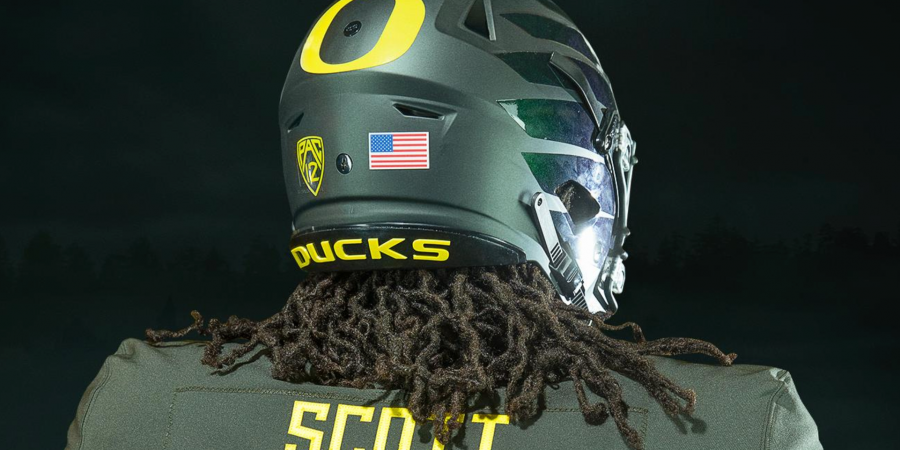
Though they didn’t deliver the same kind of eye-popping effect that last year’s uniform unveiling provided, the Oregon football program didn’t shy away from making a fashion statement with exactly two weeks to go before the start of the 2019 season.
In fairness, last year’s uniforms were a full-on redesign that marked the start of a new era both in terms of the jerseys the Ducks would don on Saturdays and the beginning of Mario Cristobal’s tenure as Oregon head coach.
This year, much of those same design and color principles remain, as the Oregon Green and Oregon Yellow uniforms will still serve as staples for the Ducks for at least the next couple years. However, there are a few notable tweaks (new nameplate on the back, slightly smaller numbers, to name a few) along with the introduction of three new uniform combos.
With the primary green and yellow uniforms remaining largely unchanged, WFOD focuses its thoughts instead on the three new uni combos from the perspective of this out-of-your-lane male scribe and his fashion-forward female counterpart.
Undisputed symbol of innovation. #GoDucks pic.twitter.com/CTWP3315oU
— GoDucks (@GoDucks) August 17, 2019
What He Said: First of all, I’m not sure if it’s because I want to see it this way or because it actually is this way, but it seems to me that the numerals on this year’s uniforms are a little bit smaller than they were last year. If my eyes aren’t deceiving me, this is a minor but much welcomed regression to the mean in my book, as the size of last year’s numerals were far and away my biggest complaint last year. That aside, the addition of “Oregon Green” to the road whites is a nice, clean look that adds some color to the virtually colorless (though still sharp!) road uniforms the Ducks wore last season. I’m a big fan of the new nameplate design and the use of color there, as well.
What She Said: What a fun use of color! I’m such a fan of this apple green color. Of the three designs reviewed, I have the least to say about this one. Not because I don’t like it, but because it’s the most reminiscent of last year’s designs. It looks very clean, almost angelic, but I’m less taken with the detailing. Well-constructed like the other two, the wow factor is undeniable. The freshness of the white jerseys allows the bright green to speak for itself. Again, we see a proper balance of colors and textures. And those shoes! They’re striking, look extremely comfortable, and ultimately the perfect compliment to the two-toned helmets.
Give ’em Nightmares. #GoDucks pic.twitter.com/uwEYLYzDXm
— GoDucks (@GoDucks) August 17, 2019
What He Said: Of the new uniforms that were revealed Saturday afternoon, Oregon’s new “Nightmare Green” uniforms are hands down my favorites. For the first time since the days of Marcus Mariota, the Ducks will be sporting a dark green uniform that harkens back to the Ducks’ uniforms of the early-to-mid 2000s. It’s a great look that works well with the recent move towards monochromatic colorways and feels like a perfect late October, early-to-mid November fit. This is also the first time since the Mariota days that we’ve seen dark green used on the helmets, which looks terrific. In short, Nike crushed it with this color scheme.
What She Said: Badass. This color combination wreaks of hard work, badass-ness, and expensive taste. Something about the intensity of this deep green is really impactful and almost intimidating. I’m impressed with the execution of the color pairing. It’s just the right amount of yellow to balance out the look. Components I haven’t emphasized before are the material(s) and construction. The high quality of fabric is apparent and the construction of the garments is impeccable. These jerseys not only look great, but you can see in the stitching how durable these were made to be. Although easily overlooked when judging outward appearances, the quality of stitching enhances the outright appeal. The shoes appear to be equally durable, well-constructed with use of texture, and did I mention badass? I want these in a yoga pant version.
The future was yesterday. #GoDucks pic.twitter.com/9aQ17FmWU0
— GoDucks (@GoDucks) August 17, 2019
What He Said: Speaking of the Mariota days, a uniform combination that was last seen most notably during Oregon’s resounding 35-17 Fiesta Bowl win over Kansas State at the end of the 2012 season, makes its return in 2019. “Nightmare Green” makes a second appearance this year as part of a uniform combination that figures to be worn on the road. The helmets and pants from the home Nightmare Green uniforms stay, while the white jersey receives Nightmare Green treatment on the numerals and patches. The new texturing on the numbers also seems to pop a little more on this combination. All in all, this is a solid color scheme that is simple, clean and adds a little more vibrancy to what we’ve seen recently from Oregon’s road unis.
What She Said: I’m a BIG fan of this color combination. Paired together, the dark green with white offers a crisp, clean look. An updated, more polished version of last year’s design. The deep green pairs well with the crisp white jerseys. Much of the aesthetic value stems from the details and accessorizing. One of last season’s design achievements was the two-toned helmets, matte with the gloss-effect wings. The “controversial”, oversized numbers from last year seem to have been updated. Possibly smaller, I can’t say for certain, with a copper-like iridescence. The same coloration found in the numbers is reflected in the Nike logo of the shoes, completing the look from head-to-toe. Well polished, well put together, well executed.
The Final Verdict
What He Said: Though last year’s uniform unveiling was a bit underwhelming in my eyes, Nike and Oregon did a great job of making some subtle, yet necessary alterations to this year’s uniform, while also including updated versions of previous uniform combinations worn by the Ducks. There was no real surprise factor with Saturday’s uniform unveiling, but that was a plus in my eyes, as a solid, though somewhat incomplete, foundation had already been laid with last year’s duds. The numbers are still a little jumbo-sized for my liking, but on the whole, the uniforms are a marked improvement on what we saw last season, with the new Nightmare Green units serving as the big winner.
What She Said: Overall, it feels like last year’s designs were updated to accommodate the elements that were well-received and improve those that were not. It’s a cleaner, more refined approach to the simplistic designs. There wasn’t a lot for me to critique here and I’m envious of the color scheme. I’m excited to see these babies in action!